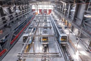
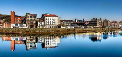
Thessaloniki gets ready for its metro launch in November
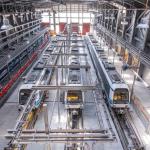
The underground rapid transit lines have been under construction for almost two decades due to various project delays
The underground rapid transit lines have been under construction for almost two decades due to various project delays

The cross pinnacle on the Tower of Jesus Christ will be ready to receive visitors in 2026 on the centennial of Gaudi’s death

Now you can get your wine in Talence by paying directly in Bitcoin

That’s because the state has to spend money on updating the railway infrastructure rather than subsidizing the cost of the popular pass

Steffen Romstöck said that he would respect the residents’ choice and would take over the helm of the municipality, even if he didn’t run

The measure, which will come into force from 1 January 2025, will be partial and temporary…for now

Rethinking renewable energy sources for the urban landscape

But operating them is still illegal under the country’s legislation

The examples, compiled by Beyond Fossil Fuels, can inform and inspire communities and entrepreneurs that still feel trepidation at the prospect of energy transition
Now you can get your wine in Talence by paying directly in Bitcoin
Rethinking renewable energy sources for the urban landscape
The examples, compiled by Beyond Fossil Fuels, can inform and inspire communities and entrepreneurs that still feel trepidation at the prospect of energy transition
The underground rapid transit lines have been under construction for almost two decades due to various project delays

Plus, it has a unique modular design that allows it to be shortened and lengthened like a train

At least, that’s the promise made by the mayor of Paris, Anne Hidalgo

Despite its church-y name, the district has long been known as the hangout spot for the artsy crowds
At least, that’s the promise made by the mayor of Paris, Anne Hidalgo

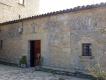
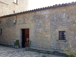
Hostal de Pinós is located in the geographical centre of the autonomous region

On the eve of the new academic year, the ranking considers several distinct but essential factors

Following a successful trial phase, these quiet areas will now be available on all main routes in the country

The academic institution shows a deeper understanding of the well-being of its students


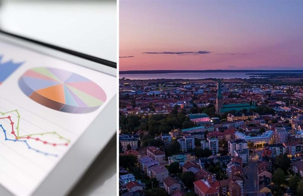
More interactive maps, graphs and charts await visitors to the Linköping municipal website, Source: Linköping Municipality
Interactivity helps to visualize and internalize data better
The authorities in the Swedish city of Linköping have decided to choose a more interactive presentation format for their statistical data concerning the territory of the municipality. The idea is that this will improve understanding and will draw in more attention to the data presented on part of the viewers.
The fact sheets use modern web technology to visualize statistics in the form of various animations that the user can largely control himself. The fact sheets also contain comments and analysis.
“By switching to visual data, we can also offer some interactivity with the user. The diagrams, tables and maps are in their basic design relatively simple, but through simple choices, the user can twist and turn the numbers and also use time animation to get an idea of how the situation in the current subject area has changed and developed over time,” explained Jimmy Lindahl, head of statistics at Linköping Municipality.
The statistics department produces fact sheets to describe both the municipality's and the nearby region's development. The data plays a central role in the fact sheets and the presentation takes place in the form of diagrams, tables or maps.
To varying degrees, some fact sheets also contain descriptive and explanatory text. They can be viewed from either a geographical or a thematic perspective.
Mr Lindahl then gave some examples on the kind of conclusions one can surmise from studying the maps and charts: “It is possible to see, among other things, that the median earned income is highest for those who live in the smaller urban areas, but also highest for those who have their workplace in the city, at the same time as it is lowest for the residents in the city.”
His examples also pointed out the way data can tell us multiple levels of information, which should be carefully considered. For example, during the pandemic year 2020, stats show that the most common age for those who died in urban areas was 85-94 years, whereas the most common age for those who died in rural areas was 75-84 years. Yet despite this, life expectancy is still longer in rural areas.
All statistical information is freely available at the Linköping municipal website in Swedish.
The underground rapid transit lines have been under construction for almost two decades due to various project delays

Now you can get your wine in Talence by paying directly in Bitcoin

That’s because the state has to spend money on updating the railway infrastructure rather than subsidizing the cost of the popular pass

Rethinking renewable energy sources for the urban landscape
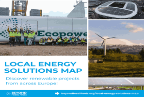
The examples, compiled by Beyond Fossil Fuels, can inform and inspire communities and entrepreneurs that still feel trepidation at the prospect of energy transition
Now you can get your wine in Talence by paying directly in Bitcoin

The 10th European Conference on Sustainable Cities and Towns (ESCT) sets the stage for stronger cooperation between the EU, national and local level to fast track Europe's transition to climate neutrality.

At least, that’s the promise made by the mayor of Paris, Anne Hidalgo
The underground rapid transit lines have been under construction for almost two decades due to various project delays
At least, that’s the promise made by the mayor of Paris, Anne Hidalgo
Hostal de Pinós is located in the geographical centre of the autonomous region
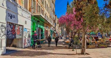
Despite its church-y name, the district has long been known as the hangout spot for the artsy crowds
Urban dwellers across the EU are having a say in making their surroundings friendlier to people and the environment.
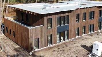
Forests in the EU can help green the European construction industry and bolster a continent-wide push for architectural improvements.

Apply by 10 November and do your part for the transformation of European public spaces
An interview with the Mayor of a Polish city that seeks to reinvent itself
An interview with the newly elected ICLEI President and Mayor of Malmö
A conversation with the Mayor of Lisbon about the spirit and dimensions of innovation present in the Portuguese capital